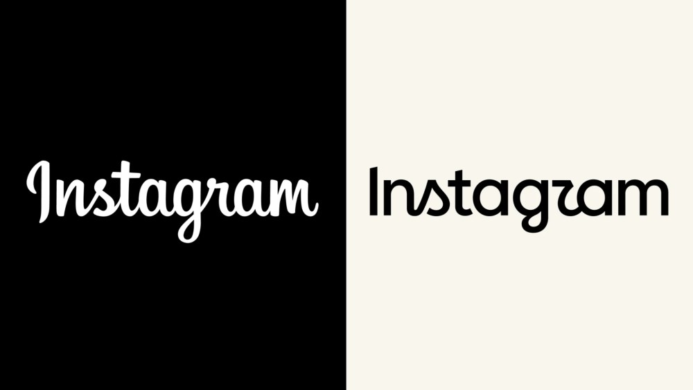
Instagram unveiled a redesigned logo last week, sparking immediate backlash from users who pointed out a particular visual quirk: the stylized letter “s” in the updated wordmark bears a striking resemblance to the letter “z,” prompting widespread online mockery referring to the platform as “Instagzam.”
Jasmine Probst, Instagram’s director of product design and a key figure in the redesign effort, defended the decision in an interview with industry media. She explained that the previous logo had remained unchanged for a decade while the platform itself had undergone significant evolution. Probst emphasized that the new design maintains the qualities users appreciate while adopting a sharper, more contemporary aesthetic that incorporates handcrafted elements.
When addressing concerns about the wordmark’s readability, Probst acknowledged the varied public response but indicated the team stands behind the creative direction. She noted that Instagram conducted multiple rounds of external feedback during development and balanced this input with design conviction. The redesign team aimed to communicate values of creative expression, quiet confidence, and careful craftsmanship through visual means.
Probst also clarified that while Instagram’s new sans-serif typeface aligns with Meta’s broader brand family, the refresh was specifically developed to resonate with Instagram’s community. The redesign involved multiple internal teams collaborating with external partners to achieve the final result.
Originally reported by Variety →
About the Author